How to Choose a Captivating Website Color Scheme
Do you get an anxious feeling when you see a webpage and think, “This just doesn’t look right?” Do you ever visit a website and think it could just be improved with a few simple tweaks?
You don’t have to be a professional designer to improve a website. The most captivating website color schemes can be the simplest. With a bit of thought, you can make spontaneous improvements to a site.
You can feel good about what you’ve changed, and you can hit refresh to revert just as easily. Don’t be afraid to experiment.
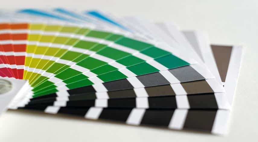
Get to Know the Color Wheel
A color wheel is a circular diagram of the different hues, shades, and tints of a single color. It offers a visual representation of the varied elements of color to help create a cohesive and captivating website.
To start, decide on a color that will be the foundation of the website palette, then look out for complementary hues. Small amounts of complementary colors offer just the right amount of contrast to make the page more inviting.
Understand Color Combinations
It is important to pick colors that are aesthetically pleasing and complement each other since color plays a major role in web design. Start by determining a primary and secondary website color palette, with one color as the main focus and another to add accents.
Consider the general branding for website elements. The colors used should tie in with the other visual messages. Use the color wheel to help determine where to place the colors relative to each other on the wheel.
Address Visual Hierarchy
Visual hierarchy is a way to prioritize information on a page and direct viewers’ eyes throughout the page. Primary colors should be bold and eye-catching, while secondary colors should be complementary.
The text should be easily readable and complementary to the background colors. It is important to think about the purpose of the website and pick a scheme that relates to the theme.
Consider Color Psychology
Consider the purpose of the website and the feelings you are looking to evoke. Bright and lively colors will create a youthful and energetic atmosphere, while muted blues and greens are more calming and will create a relaxed ambiance.
Color psychology is a powerful tool that can be used to influence the user’s experience and create cohesion between the site’s elements. With thoughtful consideration, the right website color scheme can make a significant impression.
Focus on Actionability, Especially Clickability
Color schemes for websites should be designed to draw the eyes of your target audience toward the CTA buttons they are pointed towards. It is important to take into account accessibility, usability, and readability within the website color scheme.
Designers should select a combination of colors that play well with the branding of the website and gives it a cohesive, inviting look that encourages customers to take action. For more ideas, you can also view these graphic designers. They can be the key to help draw attention to the main elements, such as various CTA buttons.
Learn to Choose a Captivating Website Color Scheme Today
The importance of a captivating website color scheme cannot be overstated. Selecting the right color combination can make the difference between a dynamic and professional website, and an outdated and lackluster website.
With a few steps and some research, anyone can choose the perfect palette for their internet presence. Why wait? Get started today and enjoy the perfect color schemes!
Did you find this article helpful? Check out the rest of our blogs!
Pankaj Majumder, a seasoned Civil Engineer, combines technical expertise with a passion for innovative infrastructure solutions. With a strong academic background and diverse project experience, he excels in creating sustainable and resilient structures that shape the future of urban development.
Recommended For You

In the landscape of peer-to-peer file sharing, 1337x stands as one of the most resilient and community-driven platforms available. However,

Artificial intelligence is not just for enterprise companies with big technology budgets. AI ML development company is already being leveraged

Using AI to deliver personalised customer experiences at scale.Harnessing AI for personalized customer experiences on a large scale. The expectations